Wednesday, November 24, 2021

Consecutive Oaky Doaks Dailies - R.B. Fuller

A recent acquisition - two consecutive Oaky Doaks dailies by Ralph Brigs Fuller from 1941.  The strip is described by Wikipedia as, "the humorous adventures of a good-hearted knight in the Middle Ages".  I had never heard of it before, but when I saw the images I was intrigued.  Firstly, by the artistic quality; Mr. Fuller was a very good illustrator for his time and better than many of his contemporaries.  But even more intriguing was the depiction of the black characters in the strip.  I find them beautifully drawn; their black, inky skin, their lean, muscled figures, and their matching turbins and shorts.  I also love the cartooning - the way they sit, sleep, and stand - all done elegantly as only a good cartoonist can do.  But the most glaring feature of the art is the depiction of these characters in the traditional racist, minstrel form that existed throughout the early days of comic strips and animation.  In fact, the auction house that sold these had them listed as "adult only", because of the racially charged depictions.

Some might take offense at me posting these online.  But I think they should be seen.  Recently, there was a great deal of controversy about the Dr. Suess estate deciding to discontinue publishing certain classic Suess books because of their "racist" content.  One, To Think That I Saw it on Mulberry Street, is a personal favorite of mine, but was cancelled due to a reference to a "Chinese Man", and the way he was depicted (with a bowl of noodles, and a long pony-tail).  I meant to write a blog post on that subject, and my yet still.  The two points I wanted to make were; we should not be white-washing history.  I think we underestimate people's ability to see these old depictions for what they were - a cultural artifact of the time.  And I would argue that the Chinese Man in Mulberry Street isn't racist at all - but it is a stereotype.  There's a subtle difference there that we should not lose sight of.  More importantly, we should be encouraging discussion about these old depictions.  We should talk about how they came to be, why they are offensive, and try to understand the history behind them.  None of that is possible if you are not allowed to see these images.

In fact, once I purchased these strips, I began to research the history of racism in mainstream American culture including comics, cartoons, radio, and the old Vaudeville Minstrel shows.  Below, I am providing links to some of the more interesting reading I did on the subject and will also link a couple of interesting videos.  I hope readers will take the time to look over the material.

https://www.tcj.com/racism-as-a-stylistic-choice-and-other-notes/

https://pencilpanelpage.wordpress.com/2013/09/20/is-it-okay-to-laugh-at-lil-eight-ball-in-2013/

https://www.youtube.com/watch?v=jP92cqTxG7I

https://www.youtube.com/watch?v=MBo3ghPMJmE


Wednesday, March 3, 2021

Arthur Adams - Sampler VI Cover


(click for larger image). I love, love, love Arthur Adams!  He's been one of my favorite artists since he first began working in comics in the mid-80's.  My comic book reading has always been dictated by the artists rather than the writers, so I have read everything Arthur has ever drawn.  He has a wonderful, cartoony style that is unlike anyone else, and he can draw anything and make it look good.  Two things he excels at, among the many, are his depictions of monsters and women.  I've been collecting female pin-ups by him and when this piece became available I jumped on it.  This piece is a nod to Snow White and features a beautiful damsel in distress, as well as the monster-like dwarves that are helping the evil witch find her.  Arthur puts so much texture and detail into these pieces - they are similar to fine engravings.  I just love everything about this piece; it's sexy, scary, and superbly inked.  Another Adams masterpiece!

Friday, February 19, 2021

Alex Raymond - Rip Kirby - 7-3-1956

(click for larger image)  I've touted the incredible talents of Leonard Starr here on my blog in the past.  He was one of the greatest of the newspaper strip artists, as well as one of its best writers - a rare combo that made him extra special. That combination of skills, which he wielded so deftly, makes him my personal favorite.  But the king of the strip artists has to be Alex Raymond.  Raymond was not the first to adapt his art style after the advent of the polaroid camera, which allowed artists to pose real people to get better "acting", staging, and lighting effects; but he was arguably the best.  Raymond already had an incredibly beautiful inking style which he used to great effect in his earlier Flash Gordon newspaper strips.  Raymond's Flash Gordon Sunday's are a sight to behold in person; large, and filled with incredibly lush inking and dramatic lighting.  Raymond was a master with a brush and reached heights few others, if any, could achieve.  

Raymond's Rip Kirby work, though not as lush and dramatic as his Flash Gordon art, would set the bar in the newspaper strip medium and would ultimately never be surpassed.  The polaroid camera was a new tool for Raymond when the strip began in 1946, and it took him years to master its use and adapt his style accordingly.  So while some of the earlier Rip Kirby work was not on par with his Flash Gordon material, he would continue to improve dramatically right up until his tragic death in an auto accident in 1956.  In reviewing the originals, it is easy to see the steady progress Raymond made year after year.  Though the strips had far fewer brush strokes than the Flash work, he used the fewer lines to much greater effect; he was a master of "thick" and "thin".  He also had a knack for drawing beautiful women and would often employ some of the incredible lighting effects seen in his earlier Flash work, made all the more dramatic thanks to the polaroid.  Raymond was only 46 at the time of his death and many wonder what incredible work he might have continued to create had he lived, but he had already cemented his legacy as the greatest and left behind an incredible body of work.

I've owned about a dozen Raymond Rip Kirby originals, and this one is probably my favorite.  This is from Raymond's final year on the strip (the last daily he drew was 9/29/56), and only a couple of months before his death.  Raymond never stopped getting better so I consider these later strips among his best, and I really love his style at this time.  From the panel layouts, to the inking, to the close-up in panel two, this daily fires on all cylinders.

Saturday, February 13, 2021

On Stage 11-14-1962 by Leonard Starr


(click for larger image) I have taken great pleasure in collecting original comic book and strip art for well over a decade.  And I have been fortunate to have owned some pretty cool things; many of which are laden with nostalgia because of exposure to them in my youth.  There is no feeling like holding an original piece of art in your hands that was used to print a comic book that you read in your childhood or teens.  The art from those books really made an impression on me.  So much so that I can recall the fist time I saw specific pages and covers.  As a young man, I never imagined that the originals existed let alone that I could own one.  And while owning a piece of nostalgia has its thrills, there is also the art appreciation aspect of it as well.  Examining the originals, and studying layouts, penciling, inking, proportion and other aspects of the art are also rewarding.  As an artist myself, it's great to be able to see these pieces up close and, hopefully, to be able learn something from them.

Collecting strip art, however, is an anomaly because I was too young to have read any of them when they appeared in the various newspapers across America.  There simply is no nostalgia factor.  For many years, my interest in newspaper strip art was based entirely on aesthetics.  Some of the greatest artists to have worked in the funny pages were the strip artists; especially those of the photo-realistic era of the late 1940's to early 1970's.  Alex Raymond, Stan Drake, Jose Luis Salinas, David Wright, Frank Godwin, and of course Leonard Starr were among the greatest.  Ironically, though these artists had immense talent, strip art has typically been the least expensive art to buy; so you really get a bang for your buck.

I can't recall exactly when I first came across Leonard Starr's On Stage work, but I purchased my first original before I read any of it.  Fortunately, On Stage was reprinted in its entirety by Classic Comics Press - over 20 years worth of stories!  I purchased every volume.  It became quickly evident to me that On Stage was a high water mark in the medium of graphic storytelling.  And as a consequence of Starr's immense talent, the writing in On Stage holds up remarkably well these years later.  I can't recommend it enough to any fan of the medium - it's a must read.

I have to admit I've developed a minor obsession with On Stage (as evidenced in the length of this post), and I'm embarrassed to admit that I've owned well over 30 originals.  I can't seem to stop collecting them. And my good fortune as a comic art collector has continued as I have been able to acquire some very nice On Stage examples.  Despite owning some wonderful originals, I was taken aback when I first saw this 11-14-1962 daily come up for sale.  Simply put, it's the nicest example I own.  It also happens to be the earliest daily I own (though I have owned earlier ones - including dailies from the first year, 1957).  This is just a lovely example with both Mary and her Husband Pete featured.  I think all three panels are terrific, and that middle panel is really exceptional.  And the inking is also some of Starr's best.  I'll shut up now and let you look at the pretty pictures!

Monday, July 20, 2020

Big Barda Poster art - Adam Hughes


(click for larger image) In keeping with my last post, I thought I'd share another Adam Hughes piece that I added to my collection not long ago.  As I mentioned in that post, Adam is adept in many mediums - pencil, ink, color, and digital color.  So the Wonder Woman cover that I recently posted scratched my itch for a nice inked piece by him.  Adam is also known for his illustrations rendered in Copic marker.  These are done in warm grey tones and then scanned into Photoshop and tweaked to add color.  It's a great technique and a clever use of both mediums.  But to pull it off, you have to be really good with the Copics - and he is.  I like this piece because it's Adam at his most "painterly" - he's so expert at layering the tones to get volume on his figures.  And speaking of his figures - Big Barda is one of my favorites!  I had never seen the original for this piece nor the poster that it was created for.  But I walked into a convention and saw it on display and fell in love with it.  Luckily, the seller included one of the original posters with the purchase.  Its  a limited edition print and I have an Artist's Proof - they're actually quite hard to find now.  But nothing trumps the original!

Tuesday, May 12, 2020

Wonder Woman 170 - Adam Hughes


(click for larger image). I think Adam Hughes has cemented his place as one of the greatest illustrators to have worked in comics.  Though he started out as just another "good girl" artist, he never stopped improving his drawing and illustration skills, and many now feel he deserves a place among greats like Drew Struzan or even Norman Rockwell (both influences).  Like Struzan and Rockwell, Hughes was never shy about using photo reference to get his images to look nearly flawless.  Hughes is a self taught artist and is very capable of working in pencil, ink, and color.  At some point in his career he took the leap into digital coloring and he's now probably better than any colorist working in comics.  While he has done interior comic book work over the years, he is primarily known as a cover artist.  Two of his longest running stints were on Wonder Woman (48 covers), and Catwoman (40 covers).

In the early 2000's when Hughes was wrapping up his run on Wonder Woman, I started seeing originals pop up in various collections.  I thought it would be nice to have one myself.  So I looked through all the covers online and picked three covers that were my favorites.  Those were 145, 158, and 170 (the three of them all have something in common - a sharp eye can figure it out!).  I've known for a long time where the 145 cover was but I think the owner is planning on taking it to his grave.  The 158 was around and then disappeared.  It recently turned up and I almost bought it, but the owner decided to hang onto it.  The 170 cover had two owners over the years.  I contacted the original owner once, briefly, but I didn't push very hard to get it.  Many years, and one new owner later, I decided to give it another go.  After discussing it on and off for a few months, we were finally able to work out a deal and I got to bring this beauty home!

It just so happens that this is Hughes' personal favorite Wonder Woman cover.  He writes in his book Cover Run:  "Hands down, this is my favorite Wonder Woman cover that I did during my run...this is the one time I felt I really nailed the Wonder Woman I see in my head.  I wish I'd been able to draw her like this every time.  The build, the rendering, the face - all spot on."  Looks good to me too!

Thursday, January 30, 2020

World's Finest 263


(click for larger image)  Once upon a time in comics, writers and editors created alluring covers to entice readers into buying each comic book.  The covers typically depicted a scene within the book - a scene that was usually outrageous, shocking, or unbelievable.  Sometimes it appeared the heroes faced an impossible doom. Sometimes it even implied that a hero would die!  The potential reader couldn't help but think "I need to see how this turns out!"  In fact, it was common knowledge that some of these outlandish covers were created first, and the writer was simply told to write a story around it.  This system resulted in a lot of interesting and unbelievable ideas.  But it was also a lot of fun.  Unless of course the scene depicted on the cover never actually happened in the book, which was sometimes the case.  Or, it was tweaked slightly within the story giving the heroes an out.  In those cases, the reader faced bitter disappointment.

This system lasted for decades, but began to decline in the early 1990's.  The new trend was to have covers that were more vague, and more iconic.  The covers rarely had anything to do with the actual story and one felt that the covers became interchangeable - any Superman cover could be swapped with any other Superman cover and it wouldn't affect the story a bit.  This new method is what we have today; long gone are the days of those eye catching covers with their impossible dilemma's.  Instead we have depictions of our heroes looking strong, brave, iconic.

When I first started reading comics, the old system was in place.  It was always fun to see how these stories would resolve themselves.  Well, not always fun - some stories were pretty terrible.  But I read them anyway to satisfy my curiosity.  Another disappointing aspect, which is still with us today, is the fact that the cover artists were not always the artists hired to draw the interiors.  So even if you had a beautifully drawn cover, you might not have a beautifully drawn comic book.  That actually happened a lot.  So these covers were really special to me because they showcased the better artists working at the time.  For DC, that meant people like Neal Adams, Rich Buckler, Ross Andru, Jose Luis Garcia-Lopez, and George Perez.  More often than not, these artists works were greatly improved by the inking of one of DC's all time greats, Dick Giordano.

Even though the stories were not always the greatest, I still have quite a bit of nostalgia for many of the covers from those days.  I was lucky to find a couple of my favorites.  One is the cover to Word's Finest 260 by Rich Buckler and Dick Giordano (seen here).  The second is this one, World's Finest 263 by Ross Andru and Dick Giordano.  Did you know Batman and Superman had sons?  Neither did I until I picked up this comic!  Too bad their existence meant the world would be doomed! (see, now you'll have to buy the comic to find out what happens!). Or if you want to cheat, click HERE (pencils by Ross Andru, inks by Dick Giordano)

Thursday, March 21, 2019

Happy Birthday Gregory Gallo


I'm missing my old friend Greg Gallo today and thinking about him on his birthday. I worked for Greg at WG Studios in Queens NY in the 1990's for a number of years. We were family. The studio was just that - a studio apartment that was long and narrow with a single bathroom. It was a smoke filled place and there was a pool table, tv, and lots of books. We worked from 11 - 7 every day which was a schedule that I liked. This was to accommodate Greg's painting schedule (he liked to sleep in). Greg was a kind of scary and intense guy with a thick Long Island accent who had red hair and a red beard. That intensity was what made him such a great artist. He was the first "real" artist I ever met. The man created almost non-stop for as long as I knew him. He designed all the art for the business which was mostly licensing for apparel companies. Each day, he'd give me a few assignments - he'd quickly sketch out what he wanted the finished piece to look like and then send me on my way - so he could get back to painting!

Greg painted all day long (he'd usually have a movie playing in the background or a great album (he introduced me to Joni Mitchell's Hissing of Summer Lawns). At 7 pm, he would sometimes send me on a beer run so he could start his long night. :) Greg was constantly experimenting with different painting styles and he liked to do a "series" of paintings. Sometimes they were very detailed and a single painting could take days or longer. At other times he could knock out five pieces in a single night! It was always fun coming in the next day to see what he had done.

Though I found him intense and intimidating, I loved him. Greg was really a loving Italian guy who cared about the people he worked with and the bigger world in which we lived. He was always thinking about nature and the environment and how we fit into it. This was reflected in his art where he would often incorporate the earth, animals, people and spirits. He told me I was in one of his paintings once but would never tell me which one exactly!

I managed to acquire a few of his pieces when I worked there. The first was from my favorite series that he had done. Each piece was very detailed and took many days to finish. He worked on several at the same time and I remember that he put himself and his girlfriend (future wife) into a couple of the pieces. I so loved them that I offered him a few hundred dollars for one (which was a lot back then). He agreed and sold it to me though he tried to get it back from me later. I wouldn't part with it and it is hanging in my home today! I used to kid him that I couldn't give it back because that was my retirement. :) Another time, I came into work one morning and there was a big 4ft x 4ft canvas that just blew me away. I gushed over it and Greg said "give me a dollar", which I did, and it was mine! That's the kind of guy he was...

Click here to see his some of his paintings: GALLO

Thursday, June 28, 2018

Superman 13 Cover

Anyone who has read my blog knows what a huge fan I am of the comic work of John Byrne.  If it's not already the consensus, he will go down in history as one of the greatest comic creators of all time.  He had phenomenal success with his work on The X-men, Fantastic Four, Alpha Flight, She-Hulk, Avengers, and Superman, to name but a few.  It should be noted that Byrne was almost always the writer and penciler on most of these titles (and sometimes inker and letterer!).  I first saw his work in X-Men 123, which my high school art instructor had in his classroom for some reason.  I was blown away by the art.  Not long after, I immersed myself in the world of comic books.  At that point, Byrne was writing and drawing both the Fantastic Four, and his own creation, Alpha Flight.  He instantly became my favorite writer and artist.

When I first started collecting comic art, I wanted Byrne Fantastic Four art above all else (you can read all about my hunt for that stuff here on my blog).  Over the years I was able to acquire some great Fantastic Four and Alpha Flight art.  A few years ago however, I re-read (again) Byrne's Superman run.  Boy was it fun!  I remember vividly when he moved to DC and took over their biggest character.  He did not disappoint.  I quickly decided that I would like a nice Superman cover for my collection.  I'd seen a few change hands, and I knew there were some good ones floating around.  I recalled seeing one cover sell on ebay for what would now be considered a very modest price - I regretted not getting it.  Saw another for sale on a website, but somehow just missed it.  Finally, I was able to find this one.  It's got a great, large shot of Superman on the cover.  When I got it, it didn't have any of the logos so I added them myself.  Typically, I would put the logos on an overlay as to not disturb the original art, but this time I applied them directly to the art.  I think it came out great.  The cover looks twice as good as it did before! (click for larger image)

Wednesday, January 24, 2018

The Power That Preserves - Original Painting - Darrell K. Sweet


(click for larger image) A journey of over a decade has come to an end!  I finally found one of the Darrell K. Sweet covers to one my favorite fantasy novels! I started collecting original comic art in around 2003 and started thinking about the original art for The Chronicles of Thomas Covenant the Unbeliever.  Originally a trilogy of books, and later followed up by sequels, these books really spoke to me when I read them in my adolescence.  I was a big Dungeons and Dragons player (for those old enough to remember), and when I saw the book covers they brought to life that fantasy world which existed in my mind.

When I stated blogging in 2007, I posted a request for information about where the original paintings for the covers might be (here).  I searched ebay, spoke with other collectors of sci-fi and fantasy art, spoke with art dealers, and networked with anyone who I thought could shed some light on where they might be.  Nobody seemed to know.  I spoke with the artist’s former agent who inquired with Mr. Sweet if he recalled where they ended up.  It turned out to be a dead end; he could not recall because they were sold so long ago (Mr. Sweet has since passed away).

As time passed, I would often contemplate the notion that I might never see one of the originals. Were they buried deep in someone’s private collection?  Perhaps in Europe or Asia?  Were they destroyed in a flood or fire?  Did someone who didn’t know what they were accidentally discard them?  I wondered all these things.  I got to the point that I would have been happy just to know they still existed.  But fate had something better in store!  After years of searching, I was able to find this painting and make it my own!  In light of all that history, this piece has a very special place in my collection – I treasure it.

For those who have read the novel, this painting may be the best of the original trilogy in that it features so many important characters and story elements– the hero (or fool?) Thomas Covenant with his “half hand”, the giant Saltheart FoamfollowerBannor of the Bloodgaurd, and High Lord Elena (and perhaps a Raver).  In the background we see the Colossus of the Fall.  In the foreground we see the Staff of Law, and most importantly, a certain white gold ring.  :)


Original paperback:

One down, three to go:


Saturday, May 13, 2017

Raffaello Romanelli 1856 - 1928 - Shepherd Boy 1910


I love museums and can spend hours exploring them.  When I lived in New York, I loved spending time at the Met.  When I lived in San Francisco, I had memberships to the Legion of Honor, and the De Young.  It's great being able to see in person, masterpieces created through the centuries.  At the De Young, there is a room of American artists which features mostly paintings, but also has some nice marble statues.  There is marble statue of Delilah by William Wetmore Story that is very striking.  There's another in the same room - Penelope by Franklin Simmons, also beautiful.  Classic marble statuary is not something you see every day.  So imagine my joy in finding just such an example for my collection!

No, this piece is not of the same caliber as the two masterpieces I mentioned above, but it is a beautiful example from the late Nouveau period.  It's a sculpture of a shepherd boy or goat herder taking a break.  He sits relaxed on a stone, his staff resting beside him, a water jug strapped to his waist, and a piece of food in his hand.  He stares peacefully off into the distance - perhaps keeping an eye on his flock.  The piece is in marble and signed Romanelli 1910.  It is likely the work of Raffaello Romanelli (https://en.wikipedia.org/wiki/Raffaello_Romanelli).  The Romanelli's are a multi-generational family of artists and they still have a studio in Firenze, Italy today.

I contacted them to inquire about the piece.  They said it was quite likely that it was carved by Raffaello, or by the gallery at the time.  I'm assuming he had artisans and craftsmen working for him that may have produced pieces like this.  His larger works are typically signed Prof. Raffaello Romanelli.  I don't know if he signed it differently because of the size or because it was produced by his studio.  Regardless, it is a museum quality marble statue that I simply love!  I'm thrilled to add it to my collection. (click for larger images)

UPDATE: I added a picture of me with the statue to show scale - I realized I never mentioned the size!

Thursday, January 26, 2017

Alan Davis Fantastic Four


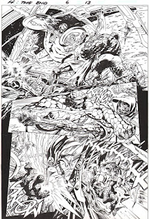
I've been a big fan of Alan Davis for many years, and I buy every comic he draws.  He's always been one of my favorite comic book artists, and over time, he has become one of the best to ever work in the industry.  I think he reached a high point with two different series.  The first was Justice League of America: The Nail, which he wrote and drew.  There was also a terrific follow up several years later (and he was that much better as an artist) called Another Nail. The other series was Fantastic Four: The End.  Davis wrote and drew this as well, and I think it's a great series.  I don't think it's a coincidence that his best artwork was also on the books he wrote himself.  He was clearly more invested in these series and it shows in the art.  And the storytelling is as good or better than any mainstream writer in comics.  He's that good.  I'd always hoped to add a Davis piece to my collection but never found the right one.  I hit upon some good luck recently and was able to acquire a few pieces from Fantastic Four: The End.  I'm posting one of the better pages here, an epic battle between the FF and their longtime foe, Dr. Doom!  I'll let the art speak for itself, but I would be remiss not to mention Mark Farmer who has inked nearly everything Alan has ever drawn.  He's an insanely talented inker, and he really brings the pencils to life.  (click for larger image)

Tuesday, November 1, 2016

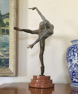
Richard MacDonald - Flight in Attitude


Here is the second of two Richard MacDonald sculptures I recently purchased.  This is a bronze depicting a graceful ballerina.  After admiring his work for over 20 years, I was so thrilled to add a piece to my collection.  This picture really doesn't do the piece justice.  The patina is exceptional - I've added a close-up picture to show the detail (click for larger image).

Richard MacDonald - Angelic Crystal


I've been really busy lately and have not had time to update my blog, but that doesn't mean I have not been buying more art!  I first saw Richard MacDonald's sculptures over 20 years ago in Las Vegas and I was immediately struck by them.  They have great proportion, balance, and grace.  His mastery of anatomy is incredible.  I always dreamed of owning one and now I have two!  This is a bust of a dancer done in "marble dust".  I found out that Richard imported some marble from Italy to do some sculptures, and used the remaining marble fragments to make these busts.  It's very lovely and graceful, and I'm thrilled to add it to my collection (click for larger image).

Friday, December 4, 2015

Leonard Starr 1925-2015


I was saddened by the passing of Leonard Starr in August of 2015. I started buying his artwork a few years ago and only recently read his great Mary Perkins - On Stage series which has been reprinted by Charles Pelto of Classic Comics Press. If you haven't read it, do yourself a favor and buy the reprints. Leonard was not only one of the all time great draftsmen from the photo-realistic strip art era, but was also one of its greatest writers. Though the series originally began almost 60 years ago, it holds up remarkably well today - a testament to Starr's great talent. If you search the web or read the introductions to the reprints, written by many top talents of the industry, you will see similar accolades for his work. He was one of the greats.

Featured here are three consecutive dailies from 1965. Notice how each daily works as a stand-alone piece, and yet they also flow together smoothly and move the story forward. The beautiful inking speaks for itself. (Click for larger image)